
This post has been updated August of 2018. In it, you will find how some things have changed over the last 3 years, and some things have stayed the same. Not to mention a few new bells and whistles that came about along the way.
It may have seemed like an eternity since websites first began changing our lives. Over the past 20 or so years, web design has reinvented itself more times than the likes of U2 and Madonna. With changes in technology and development, to societal and economic changes in our daily lives, the world has a strong impact on how we conduct business.
It’s no secret that websites have been evolving since their inception. What was once totally unique and intriguing is now cliché and out of date. (see animated gifs) (Which is actually now back in style ironically) Trends dictate how we convey our businesses online. You can bet that there are some definite changes coming for modern day websites, and you better be paying attention. Here we will discuss the top three most important trends you should be paying attention to.
Below I've included the hottest web design trends for 2018 in addition to some nostalgic remembrance of what was 'IN' in 2015. What's going on today?
#1 Animation
What was once a website crippling feature, new technology has made it possible to incorporate motion on your websites to bring them to life. A continuing trend is the use of video.This isn't new but it's gaining momentum in a snowball effect. What better way to convey a lot of content quickly and efficiently? Video is being used in innovative ways such as backgrounds, banners, pop ups, and more. But often video files are large and bulky and cause load issues for the user. Enter the reemergence of the GIF!!! Animated Gifs have become an innovative way to incorporate short video clips on your site with a fraction of the file size. With the means of production ever increasing, we're seeing a lot more animation being used in creative ways all over the web.
#2 Artificial Intelligence and Machine Learning

Arguably one of the most groundbreaking, industry disrupting and technology advancing trends is the use of AI. From chat bots to machine learning, you're going to see more and more in the months and years to come. That's because it is so effective, and it's literally everywhere. Services like Drift uses artificial intelligence and bot technology to revolutionize conversations on your website. You can capture the science of email marketing with the ability to customize email send times through the AI capabilities of Seventh Sense. Another awesome service is SRAX. SRAX is an advertising platform and service we deploy to offer an omni-channel advertising program. The ability to leverage their software to develop highly customized audiences allows us to drastically decrease the cost per lead while increasing the quality scores. The platform implements machine learning, block chain, and artificial intelligence (AI) as well as a massive library of existing data. Truly AI is beginning to touch every part of our lives.
#3 Micro Interactions
Another member of the list that is no stranger to the web industry are micro interactions. Vamsi Batchu with UX Design describes Micro Interactions as:
Micro-interactions are events which have one main task — a single purpose — and they’re found all over your device and within apps.
You can see an example of a micro interaction below
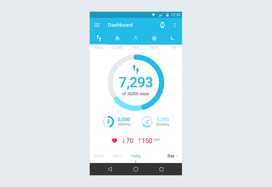
Gif sourced by Web Designers Depot
With the proliferation of mobile usage, micro interactions are becoming increasingly important. By strategically positioning these micro interactions, we can make the best use of limited screen space to present content and we can enhance the user experience. If you're considering an upcoming website redesign, make sure to include micro interactions in your strategy and watch your engagement increase.
BONUS!!
#4 Bold and Adventurous Colors
Designers are branching out and using bold colors in ways that connect with the visitor. We're seeing vibrant gradients and in your face colors being used in very creative ways. We're also seeing the reemergence of drop shadows as well to provide depth What will be interesting to see is how color can be used alongside customization and personalization to create truly unique experiences for consumers. And bold color is not just for the web. We're seeing bold colors that span multiple platforms and are being integrated into the heart of brands across all channels. If you're looking at a brand refresh, don't be afraid to be bold!
With the advancement of technologies that span the industry, we're seeing trends continue to change moving forward. Sites are becoming much more user centric and conversion focused. Because of this, we as users will enjoy more engaging sites as we browse the web. With more powerful browsers and development coding, we are not only able to revive long lost features such as the Gif, but we are able to be much more strategic with our digital presence. If you do not keep up with the changes in the industry, you may risk falling behind not meeting the true potential of your website as a lead generation machine.
Previous Trends from the past...
#1 Responsive
I had to leave the below in here because it is funny to see how the web has progressed. Responsive is not even a question today. It is the standard. In fact Google is using responsiveness as an actual ranking factor now. There is no question that a site must be responsive. Fortunately much of the available technology today takes that into account and automates a lot of the leg work. However, the opportunity with responsiveness is to tailor your mobile experience strategically to the mobile user. By incorporating different types of conversion elements, making use of the smaller screen real estate in creative ways and even considering the position of the hand while holding the phone, you can capitalize on the mobile UX and leverage it to increase conversion percentage.
Responsiveness isn’t anything new. For the past few years, or really ever since the invention of the smartphone, responsiveness has always been a focal point for good user experience. But this trend is here to stay. Responsiveness isn’t some neat feature of websites anymore; it is the rule by which any website must live if they hope to stick around longer than a year or two. I would even venture to say that not having a responsive website could ultimately be the downfall of your business. It’s that important!
But responsiveness goes much deeper than having your website display properly on a phone or tablet. Designers have begun to look at the radical shift to mobile consumption of web content and changed their designs to facilitate a better user experience. One example of this change has come from the fact that mobile users don’t have a mouse. At one point in time it was assumed that everyone who was viewing the website had a mouse; this lead to fancy roll over effects or image swaps based on the position of the curser. But with the majority of people now viewing sites on mobile devices, the greater numbers of people aren’t using a mouse. This is leading to the abandonment of such functionalities in favor of more click generated functionality.

The “click” is described by Smashing Magazine as the activate function. This can be a tap, swipe, waving your hand in the air, voice command, etc. All of these actions activate something on the phone. Thus, the new default is activating. Moving forward, designers are thinking of new ways of user input. Not everybody uses a mouse anymore.
Also, not everybody is connected to high speed internet all the time. People who are using mobile technology are often out and about without being connected to internet at the home or office. Because of this many 3g users suffer when viewing complex designs on mobile. This has given rise to longer scrolling pages. Users find it easier to scroll rather than click a link to get additional information. It also cuts down on load time, which leads to the second major change in web design.
#2 Minimalist
The minimalist or flat trend has not died off completely, but changed in recent years. Due to advances in technology and browsers, users can experience more complex elements on a website than they were previously. Because of this we've seen flat design evolve into incorporating elements such as drop shadows and gradients, which historically, have been problematic for many browsers. As Tom May and Phillip Morris write in their post on the Creative Blog
"Thanks to headway made in web browser functionality, we’re also seeing a revival of shadows. Like gradients, shadows were shelved in favour of minimalism and 2D design. Realism and skeuomorphism are still out, but in 2018 designers will be experimenting more and more with updated, softened, and stylised shadows in their work.”
Because more and more users are on mobile devices with less than ideal connections, designers have taken this fact into account when designing and we see the emergence of flat design or minimalist designs. By stripping away all of the non-essential elements to a website, it will in turn function better than a website that has tons of elements to load.

As Nathan Weller notes in his blog for Elegant Themes, even Google has taken notice of this by bring about what they call “Material Design”. Essentially it is flat design with a few dynamic elements like gradients, layering, etc. But the premise is on simple design that conveys a direct point and is easy to understand.
#3 Personalization
All the rage back in 2015, personalization has settled in as a standard in the industry now. From emails to websites, there are tons of tools to personalize content. Angel Niñofranco with Search Engine Journal put together an awesome guide for anyone that has yet to take advantage of this approach.
Everywhere you look now you see personalized content being delivered directly to the user. Log in to your Netflix account and you’ll see everything from your recently watched videos to a list of popular videos that you might enjoy. Your Amazon account delivers items you might be interested in based on your previous purchases. In addition to the old practice of using cookies to determine what content will be delivered, websites are now able to tailor their content directly to you with Smart Content.

HubSpot defines Smart Content as: “…also referred to as dynamic content, is website content that changes based on the interests or past behavior of the viewer. Smart content is designed to offer a more relevant and personalized experience to your website visitors -- one that static content can't provide.”
This practice has been proven to increase engagement and ultimately generate more leads. It does this because it creates a personal connection with the website visitor. How much more likely are you to enjoy a website, if when you went there you were greeted with “Hey James, welcome back!” as opposed to “Hello and welcome to our website”. Smart content has been used in emails and newsletters for ages but in the last few years, we’ve seen it becoming more prevalent with websites. Look for this trend to continue and become even more fluid in the coming years.
All in all we are seeing web design move toward a cleaner more simplistic view that is focused on the message and clearing away all the clutter. Due to a shift in internet consumption moving toward predominately mobile usage, there are many different factors that are starting to influence web design. But the one constant is the objective to deliver your message directly to the person you want, when they want it and where they want it. By personalizing it, we increase engagement and delight customers who in turn will be evangelists for our business. We can guarantee that trends will once again change, but by staying up on how technology is affecting our daily routine, we can anticipate these changes and design for the best user experience possible.