
In the digital age, your website has never been more important.
It needs to have your logo, your colors, and your value proposition statement, and it needs to have the ability to convert.
You can have an incredibly strong online presence, but if your website was not designed to allow people to submit their contact information for something in return, you’re in trouble.
To give your website the help it needs, here are some strategies that you can use in your design that will garner more conversions.
1) Call Out Important Text
There are a number of ways that you can bring attention to specific pieces of text.
You can use ‘negative space’ or white space to break up chunks of text into smaller or more digestible portions. If your website copy looks jumbled together, there’s a good chance that one of your site’s visitors might agree. Be sure to evaluate if you can enhance your copy with line spacing, letter spacing, or any other strategies.
You can use ‘negative space’ or white space to break up chunks of text into smaller or more digestible portions. If your website copy is too heavy or looks jumbled together, there’s a good chance that your site visitors will skip it altogether, missing out on important information. Be sure to evaluate if you can enhance your copy with correct line height, shortened copy that doesn’t go to each edge of the page, or other strategies to clean up readability.
Good designers will understand how to make designs adhere to an “F layout.” This design best practice takes into account how people read online content. They start at the top and read from left to right. Your pages should be laid out in a way that takes this into account.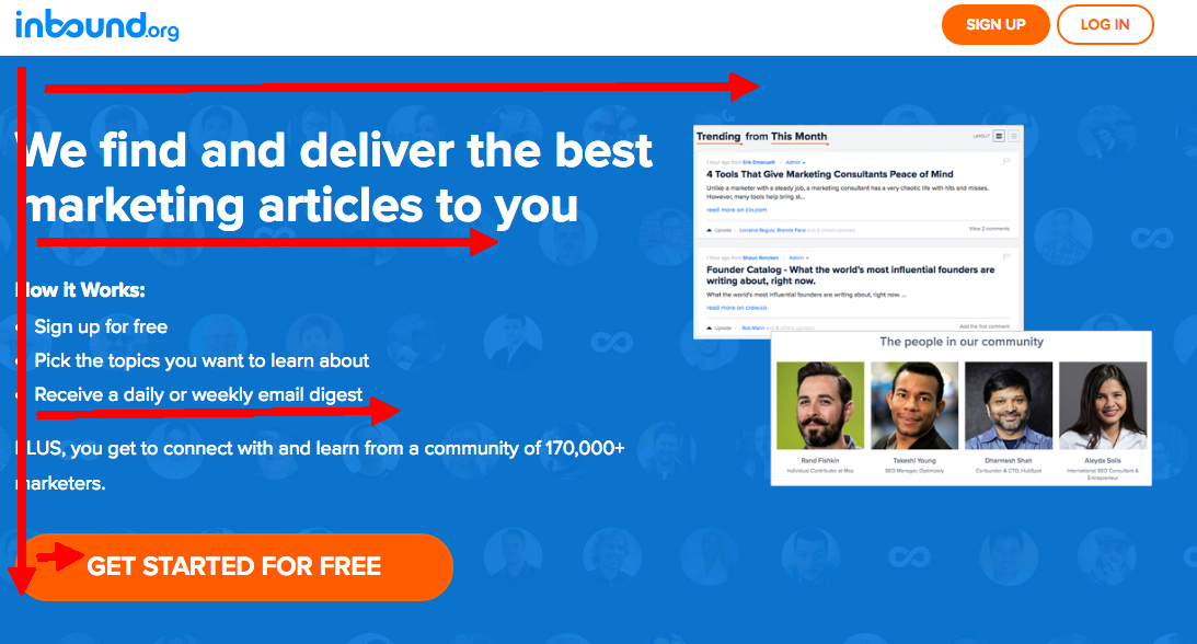
Another way to call out important text is to utilize color contrast. You can see an example of that in the above screenshot—the orange button contrasts very well with the blue background. This section clearly wants you to sign up and create an inbound.org account. (and oh yeah, it’s free!)
2) Use People in Your Design
A lot of successful design practices are rooted in design, and this is no different.
Humans are very skilled at detecting another person’s emotional state. A company can easily create a positive appeal or a trustworthy image by showing a person conveying emotion on their website.
In fact, there are many regions of the brain that are responsible for understanding faces and emotion. The face fusiform area is the part of the brain responsible for perceiving faces, and some studies have shown that we react to simple smiley faces similarly to how we react to real faces.
Companies that understand how they want to personify their business are great at this. They might not have the most developed or sexy website, but they hit with you with the right emotional appeal from the start.
Though there are cases where the design does not call for that personal connection, having imagery of people that the audience associates with has shown to create an emotional bond, and can increase brand awareness and stickiness of the page.
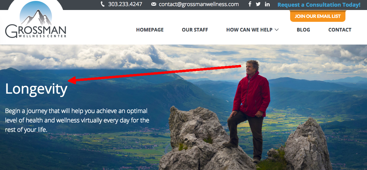
In the image above from the Grossman Wellness Center, the man looks off in the direction of “Longevity” with a determined look on his face. Allowing your imagery to work in connection with your design, brings a natural flow to increase visibility to your content.
3) Minimize Distractions
It is scientifically proven that the more choices someone has to make, the more time it will take for them to make that decision. This is known as Hick’s Law.
With that understanding, a visitor will make a quicker action on your website if you limit their choices.
Minimizing distractions can be thought of in a few different ways:
- Not overdoing the design - your site doesn’t need a library of fun and irrelevant photos, obnoxious moving gifs, and unnecessary javascript. Keep it simple and let your CTAs speak for themselves. Don't make them compete with any other distracting elements.
- Efficiently categorizing your website - group menu items into high-level categories to display them in a clean and organized manner. This allows for gateways to other critical pages your website, and it creates a better user experience.
- Let your content be high-level enough to scan - people still read on the Internet, but they mostly do a quick scan to find the key points that stick out. Keep this in mind for your website.
I will admit, there is a prerequisite for this tip. You have to have an understanding of what you want your traffic do when they get to your website. Without this, you’re missing a critical ingredient that is the ‘secret sauce’ for this strategy. But that's what marketers are for!
4) Get Attention
It is very difficult to be successful without getting the attention of your target audience.
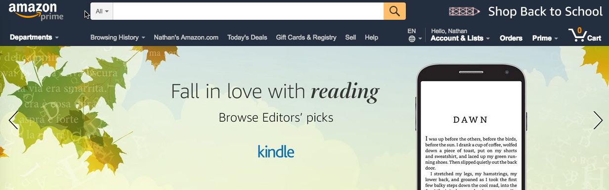
Well-designed websites are set up to effectively capture attention. Just look at Amazon’s new header. Promoting the Amazon Kindle through clever puns about Fall (since it is Autumn), text in the device, and images of leaves turning with words in them (that reinforces the whole reading thing).
Copywriters think strategically about the headline text they use, and might be more prone to use power words paired with concisely written body text. Graphic designers use eye-catching images with contrasting colors to create something visually stunning. Developers utilize their knowledge of code to create animations and incredibly functional websites for users. The effective combination of all these is what will capture your audience’s attention.
We only have 8 seconds to capture someone’s attention before they lose concentration. That’s not a lot of wiggle room. Make sure you use people and other design strategies to call out important text and capture your audience’s attention.
Not sure if your website was built to convert? We can help! Schedule an expert consultation with us so we can evaluate what your website needs.