Integration Success with Databox and HubSpot: a Match Made in Heaven


Many organizations understand that success is often determined by the ability to make smart business decisions driven by real data. Some believe that real business intelligence requires advanced skill sets in development and analysis. Even fewer grasp how to use data to tell a meaningful story that resonates with an audience.
As the MarTech industry continues to expand and evolve, offering new features and advanced-level insights, more of the data storytelling responsibilities have fallen on the shoulders of marketers. From reporting internally on their campaign activity and its contribution to the brand’s bottom line to presenting compelling data stories to their prospects and customers, Marketing is now more responsible for translating complicated metrics than they have ever been before.
The thing about data, though, is that without proper structure, it can become a giant lake capable of drowning executives.
Enter: dashboards, which are essentially storyboards of the data world. Seemingly simple, it can be challenging to organize data sets and apply visualizations that help stakeholders truly understand what is going on across their organization.
After years of manually producing monthly, quarterly, and annual reports for our clients, we explored a new tool that would completely transform our reporting capabilities along with the insights we are able to provide.

Tremendous Time Savings
Given the number of tools most teams are working with these days, it is very tedious to manually track down and collect data from multiple sources. Add in the time it takes to reformat the numbers and information into something organized and helpful, and you’re facing potentially several hours’ worth of work depending on complexity, frequency, etc. That doesn’t even account for the time it takes to thoughtfully analyze the data and draft any anecdotal observations.
Databox offers connectors for almost 50 different tools that are common across organizational tech stacks and they are constantly building new integrations. What does that mean for you?
Spend a nominal amount of time up front to connect each source and then sit back while Databox fetches all of your important metrics. The best part is they’ll be organized into convenient blocks on a dashboard you get to create. You can frame the data story in the best way that will resonate with your teams.
Get Insights in Nearly Real-Time
Many of the connectors and metrics supported by the Databox platform are set to pull data hourly, which allows for maximum visibility (especially when compared to monthly static reports). Whether you connect the databoards to a TV monitor in the office or bookmark a direct link in your browser, your data is more accessible than ever before.
Additionally, Databox includes a feature that allows users to create custom notifications based on metric thresholds in order to draw immediate attention to something important, be it positive or negative. When things are going well, this provides opportunities to celebrate early and often!
On the flip side, when shit hits the fan, this allows for immediate course-correction. For example, if your website’s daily traffic tanks out of nowhere, you can dig in quickly to figure out what is going on instead of waiting until the end of the month to discover that the monthly number is down compared to the months before.
Track Metrics that are More Meaningful
Too often, it can be tempting to take one of two futile approaches to tracking metrics:
- Tracking too many metrics, which typically results in a lot of noise and distraction; or
- Straight up tracking the wrong metrics, which can result in inflated perceptions of performance
The powerful thing about most reporting tools is that they give the user choice with plenty of options and combinations of data points, dimensions, and variables. But just because you can track 135 metrics across your dashboards doesn’t mean you should. In fact, when it comes to accurately telling the data story, less is more.
What’s great about having access to so many built-in metrics in Databox is that you have the option to pick and choose the ones that most accurately reflect what’s truly happening in your marketing and sales ecosystem based your unique set of tools and processes. That’s the backbone of telling a meaningful data story – what metrics, for better or for worse, really give the at-a-glance view?
How You Can Ramp Up With a Databox – HubSpot Integration
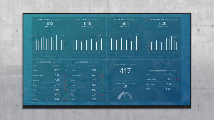
The Databox team has made the barrier of entry incredibly low in terms of getting up and running on their platform by launching the Template Gallery. There are dozens of useful templates users can very simply download to their own portals. From there, it’s a matter of connecting data sources (also easy), some optional lightweight customization, and you’re off to the data races!
.png?width=880&name=Carpe%20(6).png)
From there, the options for further build-out are endless. Databox is a flexible tool that can be as lean or robust as you need it to be. We’ve created a number of customized dashboards to help tell the most meaningful data stories for our clients.
We’d be happy to work with you to turn your vision into a data reality!
