

When we think about what makes a good or bad website design, the initial thought is to focus on what we call the “look” or “feel” of the website. This can include colors, images, fonts, and ventures into layout and structure. That's not to say that these things aren’t important, but good web design goes much deeper than that.
What separates the good from the bad is found in the strategy behind the design, the user experience and methodology of how the website is used as a tool for your organization or business. In fact, Steven Snell with Vandelay Design, ranked appearance as the last factor in his 7 Factors that Separate Good Websites from Bad Websites.
Long gone are the days of just putting something up with boilerplate text that is intended to be nothing more than a digital business card. The world has changed and with the evolution of the internet, it has become imperative that your website has a sound strategy and is designed for conversion.
Some ways to spot the difference between good and bad sites:
Is it targeted?
Well Designed Sites:
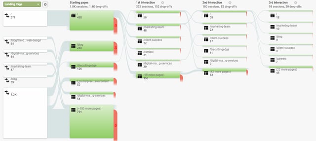
Good sites have clearly defined conversion paths that guide the user down the intended course and lead them to the content that is most important to them. Looking at your Google Analytics Behavior Flow, you can evaluate if users are following your intended path through the heirarchy of your website. By using meaningful language for headings and calls to action that resonate with the user, and allow them to easily identify what they came to the site for, you can guide them through your site as opposed to letting them struggle to find their way themselves. HubSpot wrote a great article on this topic called How to Design a Persona-Centric Website Experience.
By positioning conversion points that are relevant to the content around them, you build preceived value for the user and increase your click-through rate (CTR). In addition, by utilizing creative animations can expand and reveal additional content so you can avoid overwhelming the user with too much content at once. Allowing the user to interact with the page to easily drill down to the content that is important to them will increase engagement and decrease bounce rates.
Non-Strategic Sites:
Bad sites tend to throw everything at you at once. Instead of focusing more on the user experience, bad websites focus primarily on promoting the companies features and benefits. Throwing a ton of information at the user before knowing what their need is, can overwhelm them and make them work harder to sift through all the information you provided to find what they’re looking for. It is much better to provide the most meaningful content along with a conversion to reach out should they have any questions.
Recommendation:
Provide smaller bits of information at a time that is relevant to the user. Implement content reveals and engaging animations to present a high level map of your page content that is easy to understand. Using SMART content allows you to target individual personas directly and present current information they are looking for. By placing strategic conversion points with relevant content, you can convert the visitor at the end of their user experience. In addition, your content should be tailored to your user, how they're consuming it and what device are they using? As Cody Ray Miller with Crazy Egg wrote,
Users leave your site when they don’t get what they expect.

Is it easy to use?
Elements of Easy to Use Sites:
It’s obvious when you come to a good website that has the user experience in mind when it was built. These sites are fun and engaging and easily guide you through the pages. Buttons, links and other conversions are well defined and labeled appropriately. The data is organized well and the pages are structured in a logical way so that the user is clear on where they will be redirected when they click a link. As a user, you will never find yourself trapped in a dead end section of the site. In fact, 79% of people who don’t like what they find on one site will go back and search for another site.
Sites with Bad UI/UX:
Too often we see sites that have no logical structure and confuse the user when they’re trying to find something on the website. It’s obvious when you land on a poorly designed site because links, navigation, pages, etc. are not labeled in a way that you can easily tell what it is. You can find yourself trapped on a dead end page without a way to access other pages and may end up causing users to abandon the site out of frustration. The site lacks consistency and it's hard to find the information you're looking for.
Now days with the proliferation of content promotion services, we're seeing a resurgence of disruptive advertising on the site. If your promotional efforts inhibit the user experience to a point that it makes your site hard to use, the return on investment of such services can be counter productive. Be sure to implement these functionalities strategically and ensure they contribute to the overall user experience.
Recommendation:
Spend some additional time testing your site from a customer perspective. Click around on the site to see if it makes sense to you. You might also have others test the pages before taking the site live to see if they can find the content they are looking for easily.
By taking time to map out your pages and content at the beginning, you can identify the intentional conversion paths you're hoping to lead a user down. Focus on the end goal and make sure that the buyers journey includes relevant content to the personas and allows for variation in their different nuances.
Is it responsive?
I hesitate to include this because it seems like a no brainer. Unfortunately there are far too many sites (some from major companies or organizations) that are still not responsive.
Proper Responsive Sites:
Regardless of the device you are browsing from, the website responds nicely and still presents the information in a clear, easy to understand way. It is important to distinguish having a responsive site from a mobile site. Mobile sites are a separate website that is designed specifically for mobile devices. A responsive site is the same website you see on a desktop, that automatically restructures the content depending on the size of the device screen.
Sites with a lack of mobile consideration:
We’ve all seen them. The sites that are too big for your phone. These sites require you to scroll left and right to view the entire page or have elements that overlap each other and provide a horrible user experience. Having a mobile site like GoMobi although better than nothing, doesn’t make the cut for good design. You often sacrifice quality content and user experience for a templated site that doesn’t match your existing design and has limited functionality.
Recommendation:
If developing from scratch, make sure to spend adaquate time making sure the page responds correctly in all browsers. If using a WYSIWYG editor, make sure the platform supports responsive layouts and structure the content accordingly. By leveraging viewport windows, you can cover all possible device resolutions.
Is it up to date?
Current and Relevant Sites:
Good websites are never “finished”. Good sites are living breathing things that are constantly changing and growing. Backed up by analytical data, good websites obsess over how to better engage their user. Through A/B testing, continual updating, and thoughtful expansion, you can keep a website up to date with industry changes and variance in user behavior. There is always something that can be improved on a website. So it’s well worth the investment to have someone that can perform ongoing maintenance when needed. This is also important for your sites SEO. As Robin Burton talks about in her article for
Simply put, if you update your website often with high quality content, search engines will love you for it.

Dated Sites:
It’s not hard to spot a website that is out of date. We all remember the good ol' days of GeoCities sites filled with animated gifs and neon colors. From the copyright being expired to having out of date information, bad websites take a “set it and forget it” approach. The owners of these sites don’t recognize the importance of maintaining a website through an ongoing basis. Leaving the same default content on the site, it is impossible to form a meaningful connection with users. You may receive some interest initially, but this is not providing a useful, genuinely helpful service to your audience.
Recommenation:
Constantly revisit your site and website strategy. Using analytic data, evaluate what is working and what isn't. Form hypothesis about how updates will impact usage and implement through a testing process to make sure your actions have the most meaningful impact.
At Revenue River we take great care in making sure that strategy is the driving force behind our design and development. From identifying the voice and messaging of the site, to comparing heatmap and other analytical data of the current site, we carefully craft a gameplan that promotes the most meaninful aspects of the business to the appropriate personas. Recently we adopted the Growth Driven Design (GDD) methodology presented by HubSpot because of the analytical approach to web design. Making sure that your actions are backed up by data and then systematically updating the site falls right in line with our idea of what "Good Design" is all about. You can read more about GDD here.
It’s pretty evident when there is thought put into a website and when there is not. Although good and bad web design can be subjective (beauty is in the eye of the beholder), the fundamentals behind the site are what makes the real difference. There is much more to a site than the paint on the outside of the house. Taking care in planning out your strategy, identifying your audience personas, and keeping your site up to date, you are sure to compete in the digital environment. Focusing on forming meaningful connections with your audience will allow you to recognize the important elements to include on the site, and provide the easiest access to your products and services.
This post was originally published on 5/25/2017 and has been updated & re-published for freshness and accuracy.