When the user is dropped into a website for the first time,
the homepage acts as a new digital world where desired content must be as accessible as possible. If this means purchasing a new shirt, the user needs to be able to do so in as little travel clicks as possible. If the user is there to browse, then brows-ability should be as pleasant as possible (similar to shopping in a nice store). This can be achieved by vibrant and clean images/text blurbs organized in a way that aids the user experience while following the rules of visual hierarchy and ceasing to get in the way of navigating the site. A website should be a place a user can go as a pleasant distraction, while simultaneously being stimulated to effortlessly engage with available content. This process can be fine tuned through usability testing and a deep understanding of how a user will perceive a digital space.
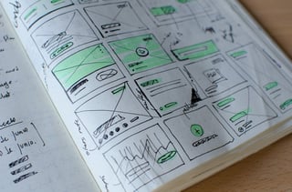
Learn-ability heuristics play a vital role in user testing and hypothesis performance.
When navigating the digital space that you have created, user's will have a preconceived notion based off intuition, past experiences, and first impression visuals. As a designer, you want the user to feel at home within your space. They must feel familiarized enough at first glance to access the information they came for, while being presented with new and stimulating information. Now as a singular human being, it is not possible to retain all perspectives of all the possible personalities of humankind. User's will individually have their own preconceived notions when confronting a new environment. This is where user testing comes into play. Analytics and user testing will allow you to receive and interpret data that states how users are interacting and traversing within your digital space. This information is vital to the systematic design approach for user experience optimization, and allowing your users to have the most pleasant experience possible when interacting with your design.
One example can be as follows;
Company A is primarily a computer repair service business for small offices and individuals. Company A offers a secondary service as a buy and sell shop for used electronics. Company A is successful within their primary service, however they are having trouble converting MQLs to their secondary service while keeping users engaged enough to convert. Company A needs to raise awareness that they offer this service in order to generate more traffic.
On quick observation of their company website, one can see their primary service listed all over their homepage and navigation menu, however, information regarding the secondary service is only listed on one page that is not accessible from their main home page. One could suggest a block of information listed just above the 50% user fold on the homepage (prime screen real-estate) that displays information of the secondary service that has a CTA to a landing page where users can inquire and touch base with the company regarding this secondary service. This simple solution increases user awareness that the company offers this service, as well as provides a means to inquiring directly.
To sum this up, know how your users are interacting with your site, and design around this while prioritizing screen real-estate to valued content and information.
Utilize Hick's Law of Design to maximize the value of your content and discern what information is needed vs. what is not.
William Hick, a British psychologist, created an in-depth analysis stating;
Hick's Law - RT= a +b (n)
(RT= reaction time N= number of stimuli a, b= variable constants)
This simply states that there is a direct correlation between the number of choices a user is presented with, and the time it will take them to make a decision.
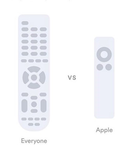
A popular example of this would be a television remote control from the 1990's vs. a television remote control from an Apple TV in 2019. The former can have up to 40-50 buttons, each button holding ground as a potential command for the user to make a desired act. The user will make one desired act at a time (raise/lower volume, change channel, etc.) and with such a large assortment of options, each desired act will take considerably longer than the measure of patience the user may have.
In 2019, an Apple TV remote control will usually have a max of 3-6 buttons. The designers behind this have realized how their customer base is interacting with their product, discerned the most used buttons, and cut everything else out. This has resulted in a more efficient user interface, and the user being able to execute the intended command at a much quicker pace.
By utilizing Hick's law, content can be evaluated by the measured importance to the user. This is the root of minimalism, and clearly articulates the importance of engagement prioritization when creating a UX strategy.
In summary, creating a strategy for optimizing user engagement is about information delivery and content evaluation. Realize the type of content that is most valuable to convey your message, as well as aid in usability. When it comes to relaying information, make sure that the intended content is digestible and easily navigated.