
What do the data fluctuations in your digital marketing metrics mean? In this article, we will walk through important concepts and methodologies to help you better analyze your digital marketing metrics and improve your strategic recommendations.
Goals
My goals for this piece are to:
- Help you better understand the pros and cons of digital marketing metrics as a whole so you don’t fall into flawed ways of thinking and make ill-informed suggestions
- Remove any fear you have about reporting and analysis gives
- Empower you to ask bigger questions and find better answers
- Make you look smart the next time you report to any important stakeholders (I need your help here. This isn’t a miracle blog.)
Table of Contents
The blog is split into three sections.
- Foundation. In this section, we will cover some foundational concepts that are critical to analysis and reporting.
- Analysis. In this section, we will break down the general idea of metrics mathematically (I promise this isn’t anything crazy. I’m no mathematician.) We will also work through an analytical process on a simplified CLV metric. Finally, we will cover a concept that will shift your paradigm on understanding data (it did for me.)
- Reporting. In this short section, we will discuss the importance of context in reporting.
Foundation

Tactical vs Strategic
The first topic I’d like to discuss is the difference between strategic and tactical. Not every metric is conducive to every level of analysis. Some metrics provide insights that shift entire business models, others can indicate if your new subject line style is more engaging, and everything in between. The latter types of metrics, I refer to as tactical metrics as they provide tactical insights. These metrics are useful for optimizing current activities. Examples of tactical metrics include email open rate and click rate—useful for optimizing email marketing activities.
Strategic metrics offer insights that can be the foundation of an entire marketing campaign or business plan. Examples of strategic metrics include Customer Lifetime Value (CLV) and Customer Acquisition Cost (CAC). Strategic metrics will be the primary focus of our discussion as they are a bit trickier to use well.
Note: There is plenty of grey area when it comes to tactical vs strategic metrics and levels of analysis. For example, tactical metrics can be used to test and validate personas which are strategy foundations. For our discussion today we will be ignoring much of this ambiguity (though if you’re interested in learning more about the strategic deployment of tactical level metrics, let me know in the comments).
Summary Statistics
 You may find the concept of statistics intimidating and that is perfectly understandable; I was the same way. If you give me a chance, I plan to demystify statistics a little and provide you with some basic foundational knowledge that will pay off (hopefully) in many areas of your life—though I’d be happy with just improving your analysis.
“Summary statistics summarize and provide information about your sample data. It tells you something about the values in your data set.” Doesn’t sound too scary, does it? For our discussion, today consider the words metric and summary statistic interchangeable. Stats snobs can yell at me later.
At a high level, summary statistics can provide us with a lot of valuable information but they also have their downsides. Here’s a list of pros and cons that we will dive a little deeper here in a second:
- Pros:
- Give us quick insight into the data samples
- Allow for easy comparison, whether to other similar summary statistics, averages, or for comparison across time
- Cons:
- Summary statistics may not represent the truth we are looking for as well as we think they do
To better understand these pros and cons, let’s discuss a summary statistic you are probably familiar with: batting average.
 Do you know what batting average is? “Batting average is the average performance of a batter, expressed as a ratio of a batter’s safe hits per official times at-bat.” Basically, it is a measure of how well batters perform. For ages, it was the golden standard for how we measured batter performance. That is until a man by the name of Billie Beane came along and demonstrated the major pitfalls of the batting average statistic.
Mr. Beane realized that batting average was a poor predictor of winning games, which is all a team really cares about at the end of the day. Instead, he surmised that on-base % was a better statistic because it more accurately predicted winning percentage. Using this statistic as his new tool, he was able to put together a winning team thus starting the era of moneyball.
This story highlights all of the points about summary statistics that I think are critical.
- What we measure doesn’t necessarily provide us the insight we are looking for. Instead, we may be misled by an over-reliance on the tool. Give a man a hammer and he thinks everything is a nail or something like that.
- When used properly, summary statistics become a powerful tool that can help us outmaneuver our competition and find success.
If you are interested in furthering your understanding of summary statistics, I’d highly recommend reading The Signal & Noise by Nate Silver and Naked Statistics by Charles Wheelan both available on audiobook as well. Note: I’m not sponsored, I just dig the books.
Analysis

Metric Components
For many of you, this may be a bit redundant as I imagine all of you remember these fundamental math concepts. However, I believe the refresh is valuable, especially, if you believe that America’s education system could’ve done a better job of getting you jazzed about math.
Raise your hand—in your head, I can’t see you—if you remember PEMDAS. Yeah, you can never forget the catchy mnemonic for the order of operations: Please Excuse My Dear Aunt Sally or Parentheses, Exponent, Multiplication, Division, Addition, and Subtraction. If you need a refresher, this should help. This is critical to our discussion today.
 Now, let’s look at what actually comprises a metric. The metrics we will be going through today are made up of numerators (numbers on top in division) and denominators (numbers on the bottom in division). When these change, the output of our metric change—world-changing shit, I know.
For example: (X+Y)/Z
- If Z increases the output will decrease
- If X or Y Increase the output will increase
- If Z and X increase by the same amount, what will happen to the output? It will decrease because Z will have more of what I will refer to as “variable weight”. That probably isn’t the right word, so forgive me. What is important is that “variable weight” in portions of functions such as multiplication and division will have more effect on the output of the equation. This will be useful when we are trying to determine the cause in data fluctuations with multiple moving parts.
- E.g., 8-2=6 while 8/2=4
Analysis Exercises

Today we are going through a few analysis scenarios on a Customer Lifetime Value (CLV) metric. There are many different ways to calculate CLV, but today we will be using a simplified formula to demonstrate how to effectively use an analytical methodology. While I hope you find the following analytical methodology helpful, it is by no means the only analysis process or even the best process—if there is such a thing.
Strategic Analysis Process
- Identify points of significant change using summary statistics (metrics)
- Interpret the high-level indications of this change
- Analyze changes in the components of this summary statistic (metric)
- Hypothesize possibilities of what these changes could mean
- Validate or reject these hypotheses by:
- Digging deeper into the components that comprise these components
- Analyzing alternative data sources—these can be qualitative or quantitative
- Testing some of your hypotheses
- Report insights and next steps
CLV = Lifetime Value (LTV) – Customer Acquisition Cost (CAC)
LTV = (Annual revenue / # of customer) * Avg. Customer relationship in years
Step 1.
So first let’s think of this metric as a diagnostic tool for your marketing efforts. We will use them to identify areas where analysis could prove useful. This will ideally save you time digging into everything under the sun. If you’d like to learn more about how to use strategic metrics, here’s a shameless plug for my other blog.
Using our strategic analysis process, we identify the following:
CLV in 2018 = $10k → CLV in 2019 = $5k
Step 2.
What are some high-level indications of this? Well, we know CLV represents the value of a customer over their “lifetime”. So by dropping $5k, we know our customer(s) are worth approximately $5k less over the course of their lifetime. This has some serious implications so instead of just leaving it at that, let’s dig deeper.
Scenario 1 – Single Variable Change
LTV in 2018 = $15k → LTV in 2019 = $10k
CAC in 2018/2019 = $5k
Step 3.
Now let’s analyze the components of the CLV metric, which is comprised of LTV and CAC. As we can see in this scenario, only the LTV metric has changed. It has dropped from $15k to $10k over the span of the year. Knowing our costs haven’t changed, we now have more context around the problem. We could either continue to dig and see what has changed in the LTV metric or move on to the next step. As I didn’t feel like going super deep into the simple scenario, let’s just move on.
Step 4.
Let’s hypothesize what a $5k drop in the LTV metric means and what it could stem from. Possibilities:
- Maybe customers aren’t repurchasing at the rate they previously were
- Maybe it was a bad year for revenue
- Maybe this was caused by failed marketing efforts
- Maybe this was caused by chance
- Maybe the # of customers has increased significantly
- Maybe it is something else
Step 5.
Now that we’ve developed a few hypotheses, we would now work to validate or reject these hypotheses. Note: try not to fight too hard one way or the other; let the data make this decision for you. There are a few ways we could go about validating or rejecting the above hypotheses.
- We could dig in further to LTV metric and its components to identify potential sources
- We could explore other data sources to see if they provide insight
- We could perform significance testing on the data
Step 6.
Report your insights in the next steps. For the sake of brevity, I will be leaving this step out of the next few scenarios; forgive me.
 Here is some coffee to keep you going! Plus, this was getting text heavy.
Scenario 2 – Multiple variables changing
LTV in 2018 = $14k → LTV in 2019 = $7k
CAC in 2018 = $4k → 2019 = $2k
Step 3.
In this scenario, we can see both the LTV and CAC components both were halved. This means they both have implications on the output, however, it is clear that the change in LTV is more significant. With two variables changing it can be difficult to develop useful hypotheses, so let’s dig in further into the LTV metric.
LTV = (Annual revenue / # of customers) * Avg. Customer relationship in years
LTV in 2018 = $14k = ($70k / 10 customers) * 2 years
LTV in 2019 = $7k = ($140k / 40 customers) * 2 years
As we can see the avg. customer relationship in years hasn’t changed so, for now, we can focus on the left side of the equation. Our decreasing LTV seemed significant and negative. However, we now know our revenue doubled and our number of customers quadrupled. These are both positive things; I would argue. However, since the number of customers increased at a rate greater than that of the revenue it had a negative effect on the output.
Step 4.
Knowing our CAC cut in half, our revenue doubled, and our number of customers quadrupled, let’s hypothesize.
- Maybe we effectively reduced our price which led to more customers (and ultimately more revenue) and dropped our spending on customers
- Maybe we marketed different products to customers and it saw major success
- Maybe this is chance
- Maybe this is something else
Step 5.
There are plenty of quantitative and qualitative sources for us to look into to validate/reject these hypotheses.
Exercise Takeaways
- I hope you discovered how misleading the outputs of summary statistics (metrics) can be.
- I hope you also noticed their value in identifying areas for analysis.
- Finally, I hope you realized how critical it is to dig into the data and not take outputs at face value. Understanding our metrics and their components is essential to leveling up your analysis game.
Critical Concept

Storytime! An airforce lieutenant hired a team of psychologists to improve his coaching and training of his pilots. The psychologist communicated that the science strongly suggests that praise, not criticism, is the best way to improve pilots' performance. The confident airforce lieutenant stated he has seen firsthand that reprimanding his pilots when they perform negatively leads to better performance on their next run and complimenting pilots when they do well leads to worse performance on their next run.
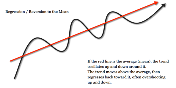
Who is right is not the question for today’s discussion, but rather: what context is the airforce commander missing? The concept is regression towards the mean.
Definition: Regression towards the mean is all about how data evens out. It basically states that if a variable is extreme the first time you measure it, it will be closer to the average the next time you measure it. In technical terms, it describes how a random variable that is outside the norm eventually tends to return to the norm.
Credit: Value & Prices
In the airforce story, when pilots performed very poorly, they are likely producing results well below their average. On their next run, they will naturally return towards this average. And those that performed above average will naturally return towards their average performance. Thus when the commander reprimanded the poor performers and praised the high performers he saw them both return towards the middle making him think that reprimanding worked better than praise.
How does this relate to us? During analysis, it is very easy to see what we want to see. Humans look for stories and we often find a causal story in data when there is none, especially when we look at smaller time frames.
We can do almost everything right in our approach and analysis of this data but still come away with shoddy recommendations, because of how volatile the data is. Instead of looking at these extremes, we need to be focused on analyzing the underlying trends. In the picture above, don’t analyze the black line too heavily, instead, look at the red line.
If you’re interested in learning more about the irrationalities of human thinking, I’d strongly recommend Daniel Kahneman’s Thinking Fast & Slow. This book has had a tremendous impact on my life even more than just sounding like a pompous ass at parties. Note: Again, I’m not sponsored, though I definitely should be.
Reporting

The reporting section of this blog is the shortest because if you understand the foundational concepts well and perform a proper analysis, reporting becomes a lot easier. Yes, there are other concepts critical to reporting such as proper data visualization and telling a strong data story, but I’ve got other shit to do. So hopefully this suffices.
Context
 Which is bigger +300% or +10% MQLS?
You’ve probably gathered that this is a trick question. If the 300% is in regards to growing 1 MQL to 4 and the 10% increase is describing adding 100 MQLs to 1k then I’d say the 10%. Moral of the story: context is key
Often we omit context because we don’t even think about it or maybe because it sometimes makes us look better or just because we don’t even think about it. To level up your reporting, always provide as much context as we can
Here are some helpful ways to provide context:
- Compare across time periods
- Compare to industry averages
- This may be easier for certain areas than others, but a quick google search may surprise you
- Compare to specific competitors
-
If competitors are public you can use Yahoo Finance or other publicly available data libraries
-
This may be easier for qualitative purposes such as comparing form size or design/UX
And remember: context is critical not only in reporting to external stakeholders but also when you’re sharing insights internally. Know your audience and convey the necessary context.
Summary
I hope my long-winded blog was valuable. We covered a range of topics: tactical vs strategic metrics, summary statistics, components of metrics (even PEMDAS!), regression towards the mean, and the importance of context.
Ultimately, what I hope you came away with is that data isn’t always what it appears to be and that we are prone to mistakes in interpreting it. Understanding these concepts and our own human shortcomings are critical to drawing better insights that lead to real-world results. Good luck and remember: if someone corrects you on one of these concepts, maybe you just interpreted the written data wrong (or at least that is how I’ll defend myself.)
If you'd like an expert to take a look at your data and provide you with a data-driven digital marketing strategy contact us below.