 Whether you're a small business owner or a web design firm you have some stake in a better website. Hopefully you or your client understands that websites don't just exist to look pretty. Hopefully you or your client understands that the people who visit your website are looking for something. Maybe, just maybe, you both understand exactly what they're looking for based on their buyer personas.
Now it's time to do something about it, by redesigning your website with inbound marketing best practices in mind.
Although we consider ourselves to be a marketing company, our roots are in web design and web development. We've designed over 100 websites in our brief history and have learned a lot about best practice principles and meeting client's wishes. As our company has grown I've realized balancing a client's wish list and creative aspiration with best practices can be difficult. Ensuring that the final product adheres to the inbound principles necessary to create ROI for your website can be tough to sell, especially once you've dug too deep into the wireframe.
In order to help client and vendor alike, it's time to spend some time on alignment.
"Mr. Client, yes, you can have a website that looks fantastic".
"No, you can not have your navigation built in Flash with crazy animation".
You have a lot of latitude between and within the standard element, but you have to have the standard elements in the right place if you're going to reach your goals.
If you're going to redesign your website, you might as well do it right. Here's how to lay out your website to maximize effectiveness:
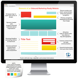
(click infographic to enlarge)

Share This Image On Your Site
Element review, some highlights and notes
- Your logo needs to go in the upper left, without challenge. Best practice also equals 'expected', don't hide your logo from visitors with any other placement.
- Navigation is often different on larger, more robust sites. And rightfully so, there are usually a ton of pages to index and left hand orientation and footer navigation are often effective. For the basic content-oriented website, top navigation is the only way to go.
- Make your phone number easy to find, put it in the upper right or center so it isn't missed. The upper right is also a great place to break out your login/portal/register/search functions too, they simply don't belong in your primary navigation.
- Your web header can rotate or sit static. Make sure it's bold contains a call to action for your primary demographic at minimum. Use powerful imagery and content, don't be afraid. This is your first impression message and it needs to clearly state what you do and what your visitors can benefit from.
- Calls to action are MANDATORY. Don't overlook this critical element, and make sure you get them in 'above the fold'. Not sure what your CTA should be? Start your process over, work on buyer personas.
- Keep your content short, put in a bold headline and get to the point quickly. People don't come to your website to read.
- Don't forget to integrate a form for easy contact, testimonials on a rotator if you have them, and a static footer with additional navigation.
There you have it, simply follow the infographic above to lay your website out. Make sure to follow your primary color palette and choose your imagery wisely. Good luck, if you think you might benefit from some goal setting and additional resources please download our ebook below.